Introduction
Hello! Whether you're a New Yorker or live somewhere else, you're now going to become intimately familiar with the traffic dangers of the streets in the Big Apple. We've worked with traffic accident and weather data from 2013-2016 and to provide you a peek into the patterns and mysterious outliers. Ready? You should be! By the end of presentation, you will know more than a seasoned local.
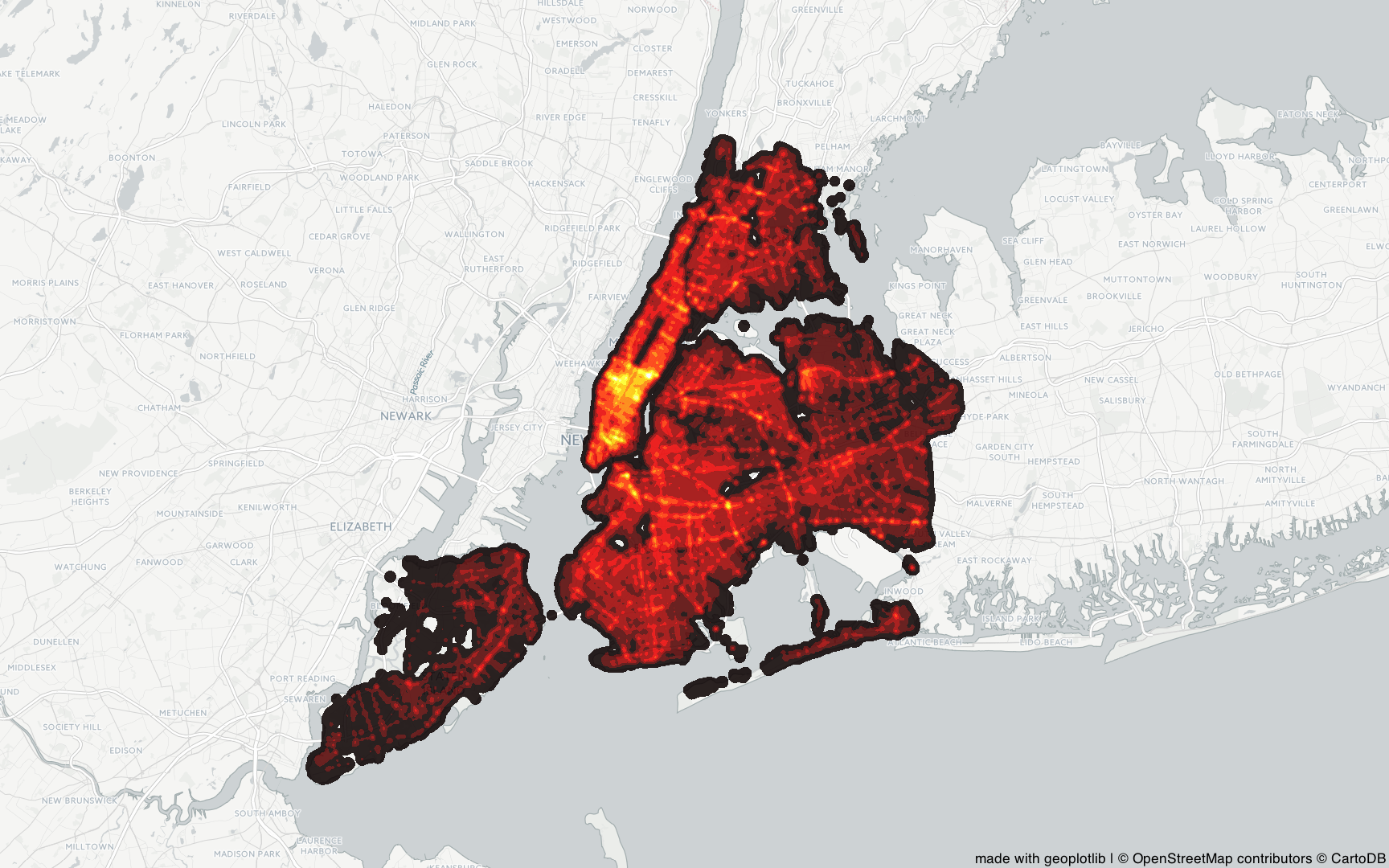
Heatmap of traffic accidents
First off, let’s have a look at how the traffic accidents are distributed in NYC. Below is a map of all the 601,313 observations from our dataset. We've provided an image file, as an interactive map would take too long to load. Take a look at the map. The brigther the color the higher concentration of accidents. As you probably notice Midtown Manhatten is the area with the highest concentration of accidents. Is this because of increased traffic in the region or is it because of the way people drive in the area? That is tough to figure out, unless you have access to data regarding the traffic flow. What we've done, however, is allowed you to explore how the observations are spread across the city for each of the years. Perhaps there are some interesting patterns. Click on the map below to taken to the subpage.
Accidents during the day
Traffic flow changes during the day. Therefore, it would seem logical if more traffic accidents happend during morning and afternoon traffic. In this section, we will see if this actually holds true. In other words: Does patterns exist for both non-lethal and lethal accidents during the day?
Try to explore by trying out different combinations of districts and observations! If you spend enough time (and attention), you might find that certain combinations follow specific patterns while other combinations behave more randomly: Non-fatal traffic accidents generally occour frequent during the morning up to late afternoon, whereas it decreases drastically. This is what we expected! That said, fatal traffic accidents, on the other hand, are much more evenly distributed throughout the hours of the day. Here is one explaination: Even though traffic is less during the late hours of the day, fatal accidents occur just as frequent because of other factors such as limited visibality and intoxicated drivers. What do you think? P.s.: Be aware that the y-axis is dynamic. Also if you want to get the observations number - just hover over the bar.
Seasonality
So, we already looked at how accidents are spread throughout the specific hours of the day. What about exploring how accidents are sprea throughout the seasons of the year? For example, do accidents happen more frequently in February than July? Are there certain months that are more dangerous for bicyclists? Let's try to answer those questions! To accomplish this we've created a time series visualizing traffic accidents involving Pedestrians, Cyclists, and Motorists in New York City's five Boroughs.
Here we see a clear pattern for the aggregated data (pedestrians, cyclists and motorists): Accidents happen more frequently during the summer months compared to the winter months. However, for pedistrians the risk is almost the same throughout the season. What is the reason for this?
It's tough to predict. One reason could be that the number of predestrians on the road are the same througout the year. The number of bicyclists, however, could increase during the summer months because of the better weather. Therefore, the risk of bicycle accidents could also propertionally increase. In terms of an explanation for the increased motorists accidents during the summer months, I would instinctively have expected the opposite trend. Winter in NYC includes ice and snow which could lead to dangerous roads. On the other hand, if motorists drive more carefully during this season that could explain why accidents are fewer.
For the aggregated NYC data, the number of accidents drop significantly during August 2016! Why is that? I've done some research and here is my best explanation. In 2016, the city of New York organized open streets throughout August 2016, in which streets were closed for cars to make room for running, biking and walking. Although the event targeted weekends in August, the logistics to set everything up could have hindered traffic to flow and thereby minimize accidents during this period.
Cyclists in Trafic Accidents
Motorists in Trafic Accidents
Total People in Trafic Accidents
Weather
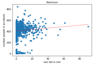
So, we just brought up weather in the seasonality section above. Initially, we expected more accident during the winter months, but the opposite was true. As a data scientist, you will learn that it is tough to argue with solid data! In this section, we will explore the combined datasets of traffic accidents and rainfall. We expect to see a correlation, but we have already been fooled once!
To get a sense of whether rainfall impacts the number of accidents, we have matched two different data sets. Below you will see a scatterplot displaying the number of accidents and the amount of rainfall on particular days. If you look closely, it is tough to see any clear pattern. This is also supported by the fact that the pearson correlation, an indicator of a linear relationsship, is 0.079, which is close to 0 and therefore indicating no linear relation. Again, our assumptions were not true. It appears that New Yorkers drive just as safely with or without rain.
K nearest neighbors (KNN)
We've now done plenty of data exploration! Let's try to see if we can predict the severity of an accident by using machine learning. This could be useful for situations in which a new accident is reported. For this section, we're going to use K nearest neighboors to predict the outcome based on geolocations. Using KNN, we're able to create a geographic grid over the city with predictions for each locations. If you're a New Yorker and have a specific route to work every day, this could show some disturbing results.
Therefore, the results are saved in a different subpage, so that we do not disturb your sleep tonight unless you're willing to take the chance. "Pssst - Fear Not". Since non-fatal accidents are overrepresented in the dataset, almost all prediction in the unbalanced dataset are of non-fatal character. However, we've also created a unbalanced calculations with an equal number of non-lethal and lethal data sampled. Don't be too worried when you view this map. It does not represent the real world (Fortuntaly!).

Decision Tree
So what are the best questions to ask in terms of identifying a lethal accident? To figure this out, we've applied a decision tree to our dateset. Without giving away too much information, we can tell you that the most important question is asking about the first type of motorvehicle that was registered in the accident. Are sport scars one of the sinners? Or is it a different type of vehicle that you should look out for? We think the answer will suprise you, because it certainly suprised us. Again, explore at your own risk by clicking the image below. We sincerely hope that you never have to use this tool for any real life situations!

Thank you
Thanks for visting! Hopefully, you now know a lot more about traffic accidents in NYC than you did before. To list some examples: You now know in which section of New York City accidents tend to happen more frequently, you know that the summer months are the most dangerous for motorists and cyclists, you know that rainfall doesn't have a significant impact on the number of accidents and much more. You probably also learned that you don't always get the results you expect.
Here is the link to the vehicle accident data: link to accident data and here is the link to the weather data: link to weahter data. if you discover any other interesting findings in the data visualizations, please share them with me: mail@johanbender.com. Until then, have a great day!